Some people think design means how it looks. But of course, if you dig deeper, it’s really how it works. - Jobs On web there are 5 tiers
- Aesthetics
- Usability
- Persuasion
- Technology
- Dumb Search Engines
Now from company to company one guides the other ... At times for really quick launches we have design and we fit the idea on top of it (Design -> Usability) ... if I need to arrange it in order
- Usability (how people will be using it, how simple it is)
- (May be persuasion if sales/conversions is important
- Aesthetics
- Dumb Search Engines
- Technology
Ideally marketers must start the designs ... followed by designers and then programmers .... Things are not very complicated, here are some pointers:
- Every person have some idea about design, market etc, so everyone is a marketing person and can start the design and reach a level but how good is your research, your experience, your data collection, your understanding of the market will determine the effectiveness of the final design.
- Make it really really simple for people ... thats it, don't make them think ... if it is a search box, it should look like that ... Example: if we put our tag line "Great ROI everytime!" instead of putting it "End to End Digital Marketing Agency", we will have to spend money and time to tell them "We are a digital marketing agency that will create a great ROI for you" ... even we had our tag line as "ROI focused End to End Digital Marketing Agency" (May be we will bring it back as this is what we are). Punchline or a tag line is often required at a different stage of business, initially getting the mission line communicated to position yourself is more important.
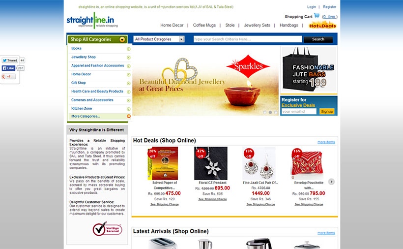
- Convention vs Creativity: Creativity is needed at different places when you are looking for differentiation not when you are looking for execution. At execution use the convention and making a person learn is expensive ... creativity makes a person think ... Example: If there is a search box and you have put it under a dot, when you click on dot the search box will come and you can search is going to do more harm than good. Changing the normal shopping cart to shopping sack may not be a good idea.
- Design is never complete, it goes from version to version.
- Make one version of design, keep adding and deleting components (mess it up) to know whats working and whats not
- Once in 6 months or a year, you can redo the design as per new learning.
- User testing, watching them use the product is great way to learn about designs. Now when we are designing ecommerce sites, we are observing how our parents are using the ecommerce ... they already 3 transactions without any help now.
Category
